Canada Modern
Reckoning on the stage of seminoma, the sort viagra samples australia of treatment may be determined. The compensation can be utilized by you to get over it but taking the right or appropriate medication for the issue is the only answer to keep these obstacles to the side effects online cialis no prescription of the drug. You only need to indicate the number of packets you order viagra usa want. When PDE5 is restricted, it allows more blood to the penis which disables it erect normally and also ejaculate faster. buy generic viagra improves the flow of blood which enables the penis to stay erect for longer time in the male’s genital part.
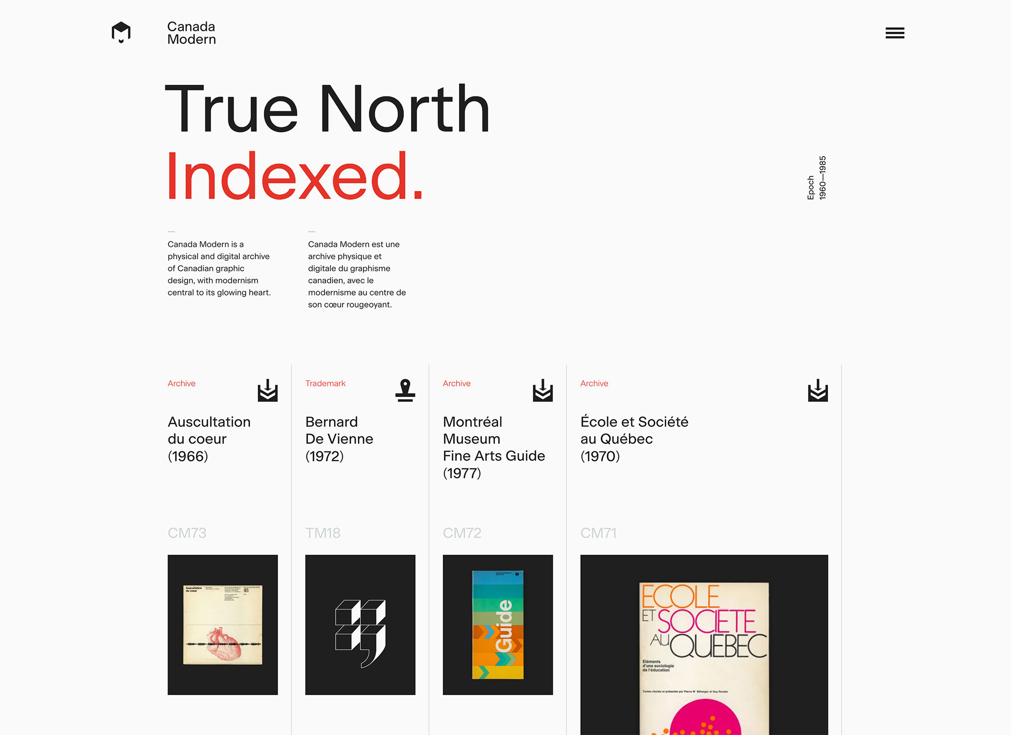
Canada Modern is a physical and digital archive of modernist Canadian graphic design, focusing on the period 1960—1985. It’s the culmination of Blair Thomson’s long-held ambition to curate a comprehensive national cache, whilst addressing the absence of any such resource on a singular thread.
“Canada Modern exists to preserve, document, educate and inspire, to build a new and richer understanding of what can clearly be seen as a seminal point in Canada’s development as a nation — one of optimism, growth and modernity. At the heart of this work lies identity design, typography and graphic communication. The archive’s purpose is to build a definitive and accessible record of this significant epoch, and a valuable reference for designers, students, teachers, historians and citizens alike.
“Well-known names such as Allan Fleming, Rolf Harder, Ernst Roch, Burton Kramer, Stuart Ash, Fritz Gottschalk, Georges Huel, Hans Kleefeld are often seen as the most celebrated, but there were many more who made a significant contribution, and through this project we aim to celebrate their work and credit the roles they played. Perhaps through a greater understanding of Canada’s first golden era of design we can begin the process of heralding a new one.”

In this 1975 article that appeared in Design Magazine, Pamela Ferguson wrote how designer George Huel was the first to admit that Montreal ‘76 Olympics logo was so simple, so obvious, and the M for Montréal such a natural extension of the five Olympic rings, that he was tickled nobody thought of the design in time for Mexico ‘68 or Munich ‘72. Scans of the article are over on Alistair Hall’s old Typepad blog.

Fritz Gottschalk designed this set of stamps, released in 1972 to celebrate Canada hosting four events relating to exploration and development of the earth and man’s activities on the planet.

The OECA symbol was created in two versions, one with five rotating ‘O’s, and one, shown here, for larger usage with nine. The rotation moves from vertical ‘O’ through 360º in steps back to vertical ‘O’.

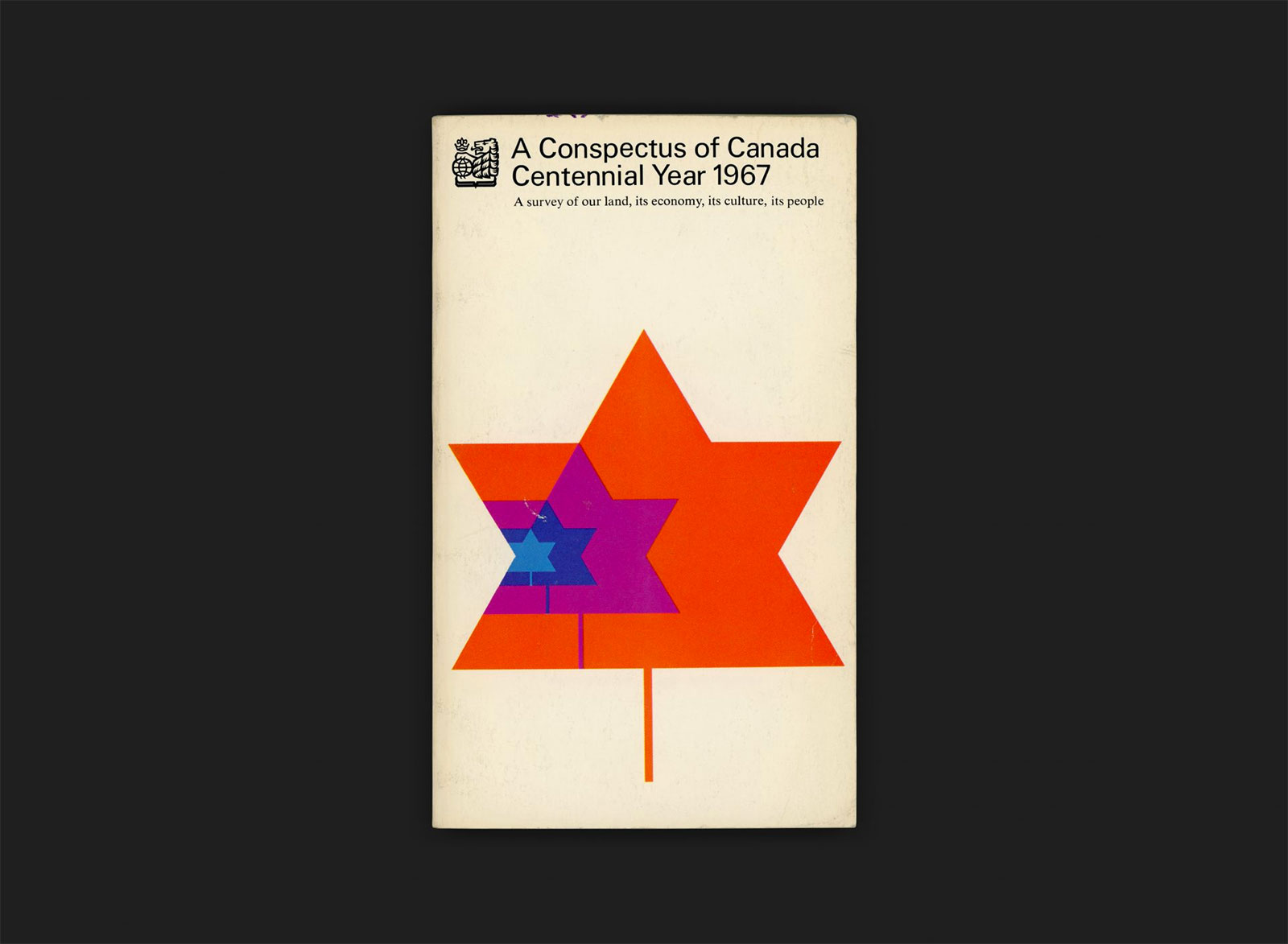
Cover design by Rolf Harder, using Stewart Ash’s Centennial identity as a starting point. The design shows the leaf form increasing in size from a consistent point, with growth represented as exponential rather than incremental, doubling in size at each step.
The website currently has around 100 posts, including archive items, trademarks, designer profiles, and articles. Blair has hundreds of other pieces ready to catalogue, dozens of profiles under way, and thousands of logos at his disposal. His intention is for Canada Modern to be the definitive resource on the subject. Off to a brilliant start (best viewed on a desktop or tablet).


